A growth case study: moving a subscription app’s signups out of the app stores.
If your product is a mobile app, the app stores control most of your growth. Apple and Google take up to 30% of every subscription sold inside the app, and they share very little about who your customers are or how they found you.
YouMail was paying both costs at once when I started working with them. This case study covers how we moved signups onto the web, what we tested once we owned every step, and what happened to the economics: conversion up from 9% to 22%, registration completion up 102%, premium upgrades arriving 2.5x faster, and customer acquisition cost down 77%.
Where growth stalled
YouMail makes AI-powered voicemail, spam-call blocking, and call-handling tools for consumers and businesses. The model is freemium: the app is free, and paid premium plans unlock the full product.
Growth ran the way most app businesses run it. Paid campaigns on Google and Meta, plus an affiliate program, sent people to the app stores to install the app. Downloads looked healthy. The economics underneath them did not.
Ad costs were rising and returns were shrinking. Plenty of people installed the free app, but too few converted to premium plans. An experiment that sent paid traffic straight to an in-app paywall failed to produce the expected lift. And every premium subscription processed through the App Store or Google Play handed 30% to the platform.
The deeper problem was visibility. An app-store funnel is closed to the company that depends on it: you cannot A/B test a store listing the way you test a page you own, and the ad platforms see an install but little of what happens after it. When you cannot measure the middle of your funnel, you cannot fix it.
The move: put a funnel you own in front of the store
The strategy was to capture and convert users on the web before they ever reached an app store. Ads would point to a landing page. Registration would happen on the site. Billing would run through YouMail directly. The app install came last, after the customer relationship already existed.
That one change moved four things at once. Every step of the journey became testable. Subscriptions started on the web paid no platform fee. The ad platforms got real conversion data to optimize against, and YouMail controlled the experience from first click to paid plan.
What the research said
We did not start with wireframes. We started with evidence from three places.
- Past ad performance. We mined historical Meta and Google campaigns to find the hooks that had already proven they could convert.
- Customer feedback. Surveys and support conversations showed what stopped free users from upgrading to a paid plan.
- Competitor positioning. A review of competing services showed how they sold and where they left gaps.
One finding shaped everything that followed: what motivated people to pay was control over their calls and messages, with privacy close behind, across both personal and business use. Spam blocking was the feature that delivered it. That insight set the headline, the imagery, and the order of the pitch.
The landing page
The page translated that research directly. The headline led with control: “Stop unwanted calls. Get AI-powered voicemail. Stay in control.” Media mentions and testimonials supplied the proof. The page had one job and one path: sign up.
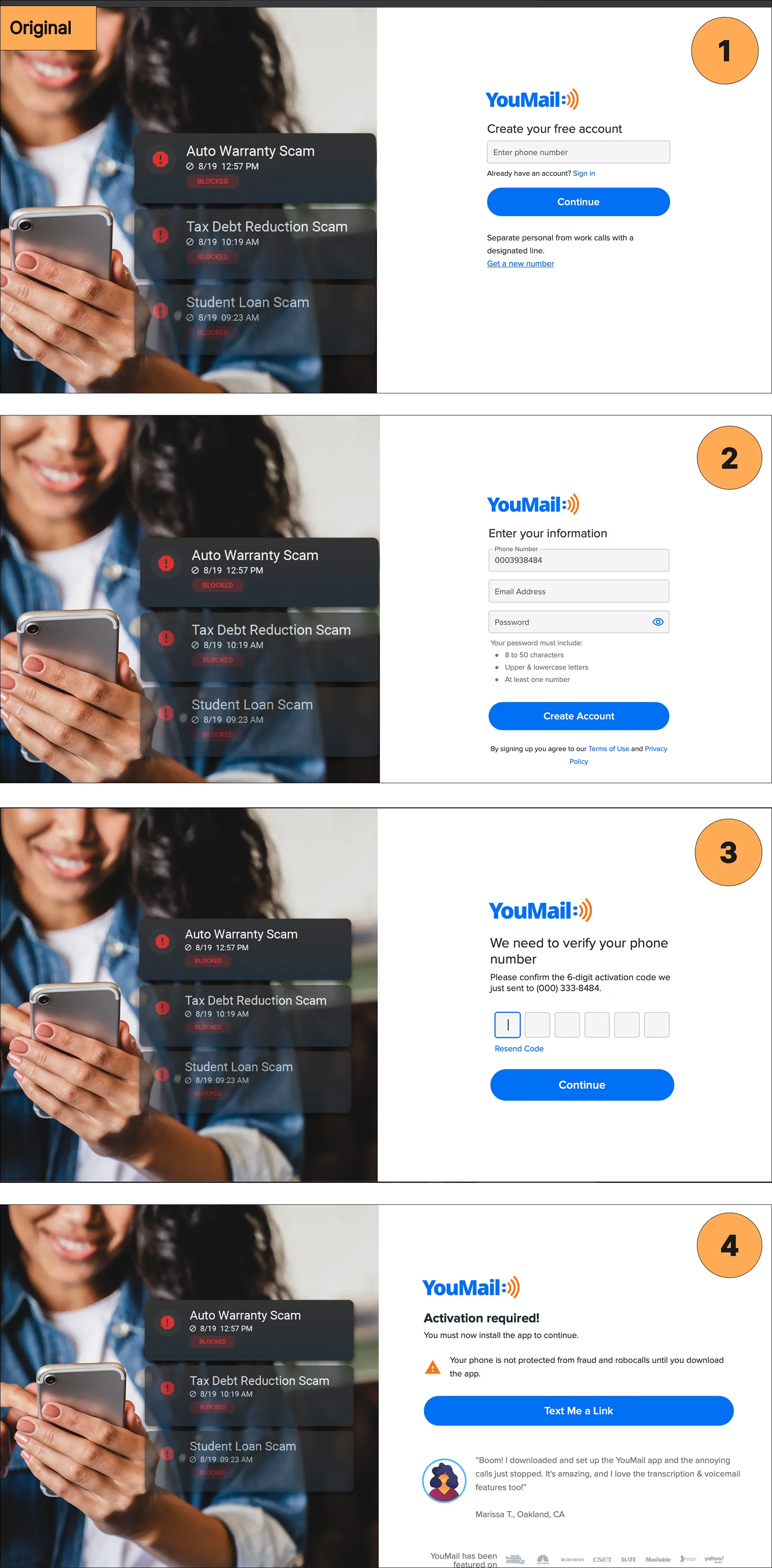
Premium had a place in the flow from the start. Onboarding showcased paid features immediately rather than leaving users to discover them on their own, which set up the upgrade moments that came later.
Each element had to win an experiment to stay on the page. We ran A/B and multivariate tests on headlines, calls to action, and page structure, watched heatmaps and session recordings to find where people quit, and removed form fields that added friction without adding signal. Control groups ran throughout, so the gains here are measured against a live baseline rather than against last month.
The page went from converting 9% of visitors to 22%, a 144% improvement. The bounce rate, the share of visitors who leave without doing anything, fell from 76% to 25%.
The registration flow
Nearly all of the traffic, 99%, arrived on phones, so the flow was rebuilt mobile-first: fewer fields, larger touch targets, and nothing competing with the next step.
The bigger fix was message symmetry. People quit forms when the page stops resembling the ad that brought them there. We aligned the promise across the ad, the landing page, and each signup screen, so every step confirmed the one before it.
Proof sat inside the flow itself: a Washington Post quote on the first screen, app-store ratings and download counts near the finish.
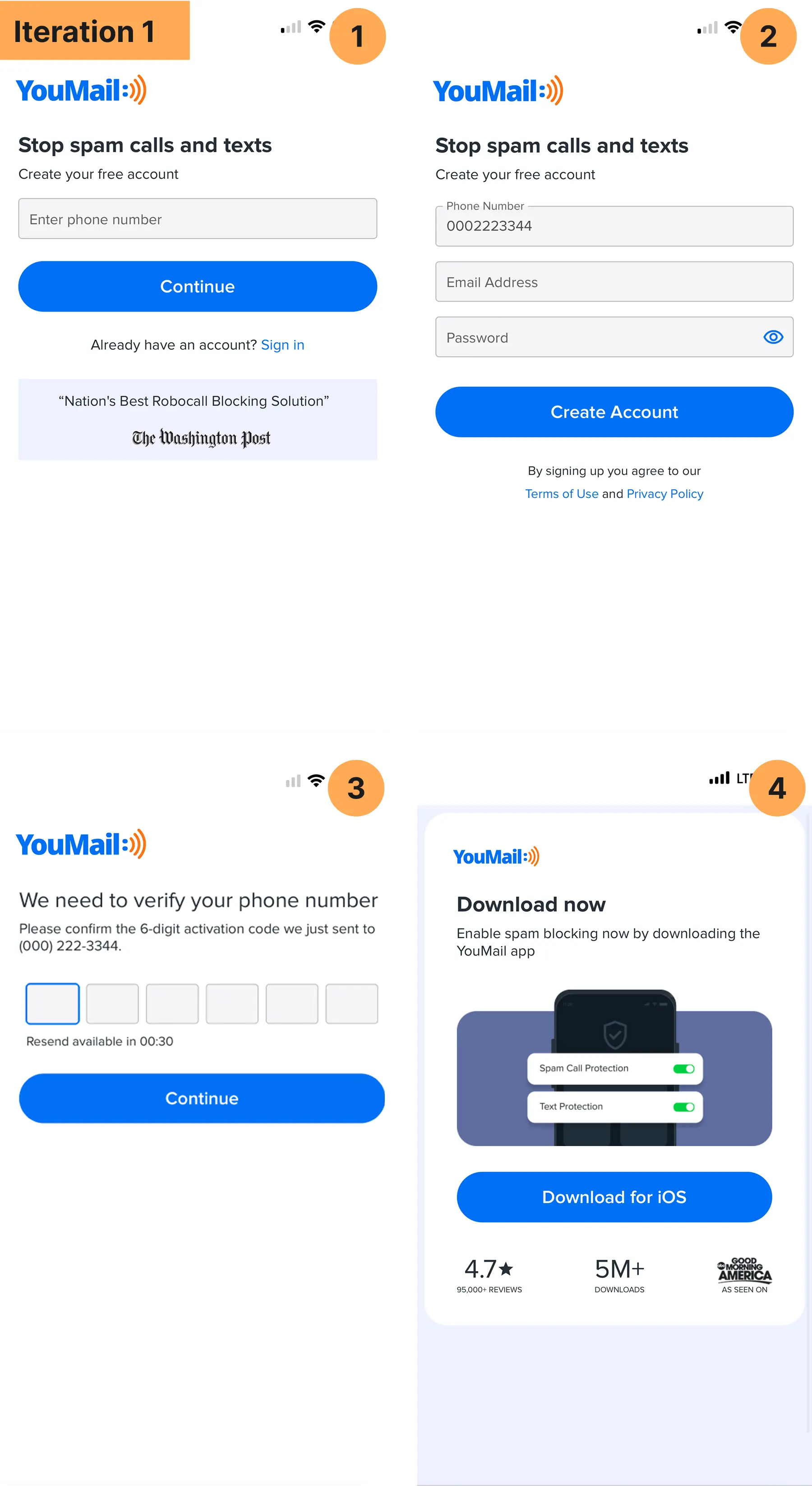
Registration completion rose 102%. Twice as many of the people who clicked an ad finished creating an account, which made every dollar of paid spend roughly twice as productive at that step.
Moving the upgrade moment earlier
Free users who settle into a freemium app can sit there for months without paying. The faster path to revenue was to put the upgrade decision inside the signup experience, while intent was at its peak.
The second iteration of the flow added a plan-comparison step directly into registration, with the annual plan presented first. A low-friction offer appeared on the thank-you page, upgrade prompts surfaced during the first session in the dashboard, and email and SMS follow-ups reinforced the case for premium.
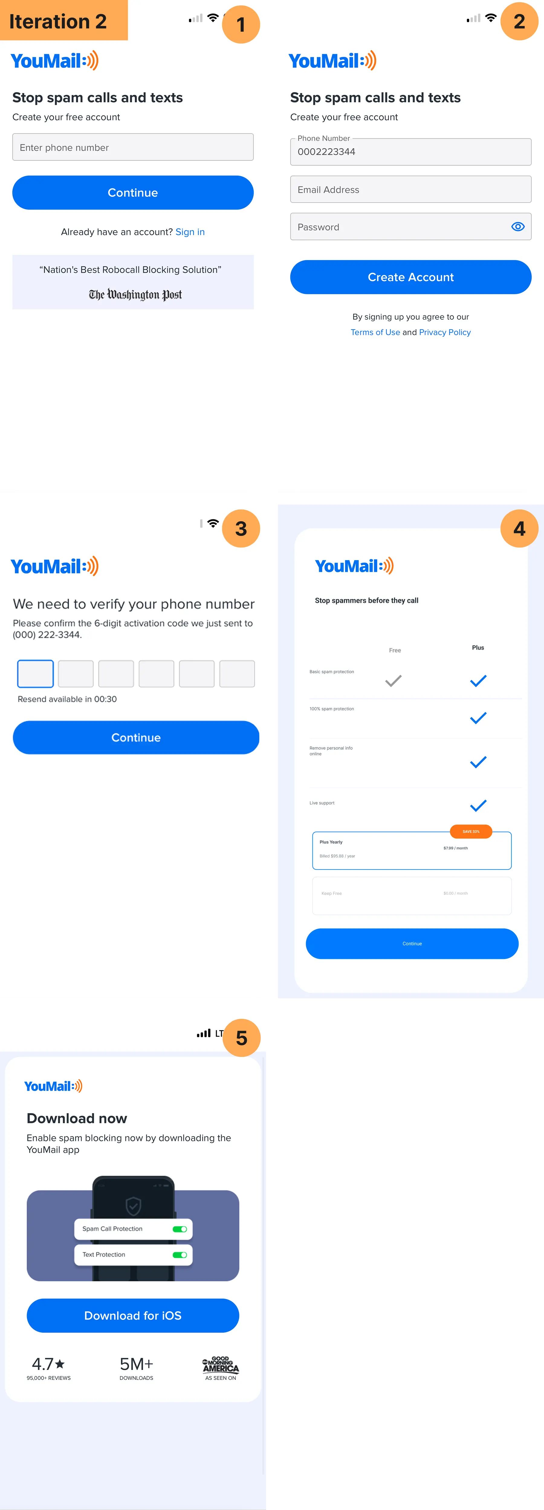
Premium upgrades arrived 2.5x faster than under the app-store funnel.
Scaling paid on cleaner data
With the funnel converting, paid acquisition finally had clean conversion data to optimize toward. Web signups produced events the ad platforms could see, so campaign optimization pointed at people likely to become customers instead of whoever installed an app cheaply.
Targeting concentrated on three segments: lookalike audiences built from premium subscribers, interest-based audiences around productivity and business needs, and retargeting for visitors who abandoned signup. Creative testing ran continuously, and the messaging that won led with the emotional payoff of control rather than feature specifications.
Customer acquisition cost fell 77%. Paid signups, which had contributed nothing before the web funnel existed, grew to 15% of new business.
The results
- Landing page conversion rose from 9% to 22%, a 144% lift, with bounce down from 76% to 25%.
- Registration completion rose 102%.
- Premium upgrades arrived 2.5x faster once the upsell moved inside signup.
- Customer acquisition cost fell 77%, and ad-driven signups grew from zero to 15% of new business.
- Web subscriptions billed directly, keeping the 30% the app stores would have taken.
The compounding is the point. Research made the page convert, conversion made the ads efficient, efficiency made the channel scalable, and direct billing meant more of every new dollar stayed in the business.
If your growth runs through an app store
The playbook transfers to any app-first business, and most of it transfers to anyone whose funnel runs through a platform they do not control. Put a page you own in front of the platform you rent. Learn why your customers pay before you design for them. Test every step against a control, and feed the resulting data back to the ad platforms.
Funnel work like this is one of the six lenses in my 30-day growth audit. If your installs look healthy while the economics quietly get worse, that audit is where I would start. Or skip ahead and let’s talk.